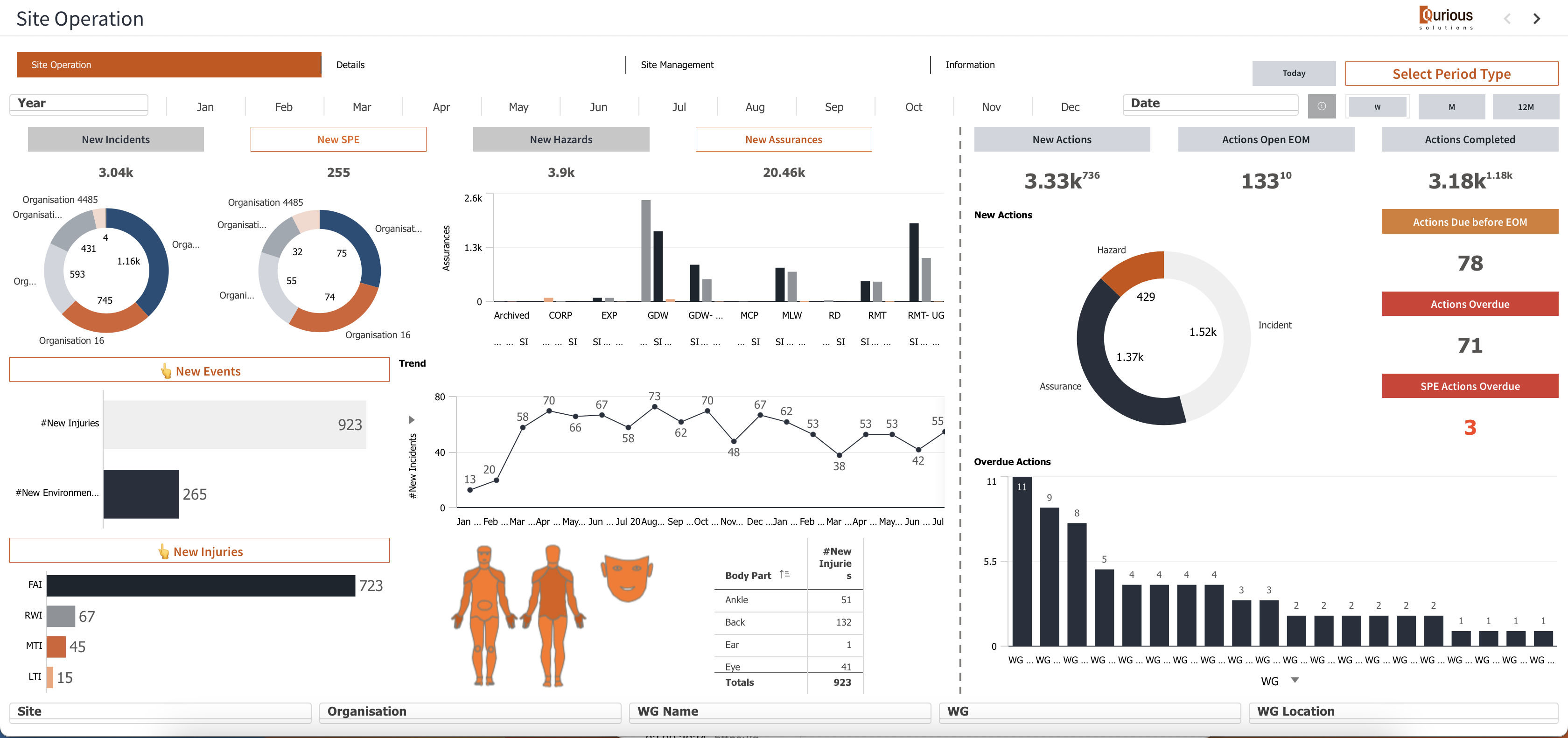
Improving information density in the tables in Qlik Sense
Many clients have mentioned that standard tables in Qlik Sense seem to contain less information compared to QlikView. A typical Qlik Sense table looks less dense compared to its QlikView counterpart, as shown in the screenshots.
Qlik View table
Usual Qlik Sense Table
I attempted to address this by reducing the font size, but it didn’t significantly improve the situation.
However, after short investigation I discovered a small trick that proved effective.
I added the following code into CSS section of the multi-KPI object:
.qv-st-data-cell {
padding-bottom: 0;
padding-top: 0;
}
This adjustment noticeably increased the density of the table, making it more informative.
Yet, for tables longer than half a page, I encountered an issue with white space remaining at the bottom. I haven’t found a straight solution for this problem, but I found a workaround: I extended the sheet and the object to fit the screen properly.
Additionally, remember to add at least one measure to the multi-KPI object and the following CSS code to hide it when not in Edit mode:
.qv-object-qlik-multi-kpi {
display: none;
}
.qv-mode-edit .qv-object-qlik-multi-kpi {
display: flex;
}
Enjoy!